I’ve been giving a lot of thought about what I’d like to see more of in 2011 and what I’d like to see go away. For this post, I’ve chosen to focus on the things that I want see more of because as we all know, beauty, whether in a person or in a room, is highly subjective. I also thought it might be kind of mean to post someone’s work and say that I am tired of it. So, without further adieu, here are a few things I hope to see more of this year.
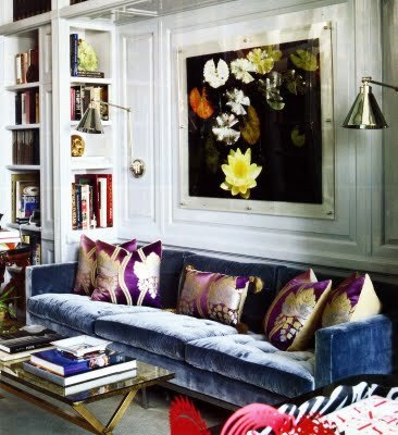
{Layered, Collected, Glamorous Rooms
-Image of Aerin Lauder’s Living Room via ELLE DECOR}
{Chic, Unexpected Combinations in Table Settings}
{More of Pantone’s 2011 Color of the Year: Honeysuckle
– Image via Elements of Style}
{Bold Colors Used with Restraint – Image via Mary McGee}
This vignette is filled with several, bold colors, yet the overall effect is more soothing than startling.
{Grey Used in Fresh, New Ways -Image via Another Shade of Grey}
I personally love the color grey, though I know some bloggers feel like it’s been done to death. I happen to think it’s a classic neutral that will never go out of style, but I’d like to see it used in some inventive ways this year.
{Traditional with a Twist -Image via Ashley Whitaker}
I think of my style as “modern traditional” or “classic with a twist”. Over the past few years, the uber-modern, Design Within Reach look has been very popular. I’d like to see things veer more towards the traditional, with a modern edge, of course!
{Successfully Playing with Scale -Image via Atlanta Homes and Lifestyles}
{A Fresh, New Approach to Design in the South – Image via Atlanta Homes and Lifestyles}
I am a Houston girl, born and raised, but I must say, I have a few qualms about design in this city. While we do have a lot of great things going on and many talented designers here, such a huge part of this city (entire neighborhoods, even!) have all fallen for a formulaic French Country look. Even though it isn’t always my taste, I do appreciate it when it’s done well and acknowledge that it can be lovely. Having said that…Houston, we need to move on to something else! It’s okay for your house to look different than your neighbor’s! I am crazy about what is going on design-wise in Atlanta. There is so much great design in that city and it is fresh and inventive, yet maintains it’s Southern sensibility. I believe in you, Houston. Just take a look at the gorgeous room pictured above designed by Southern design doyenne, Suzanne Kasler. I think it appeals to “traditional with a twist” people as well as the French Country folks. Let’s try something new this year!
{A Nod to the Past without doing the Full-Scale Regency Look
– Image via Benjamin Dhong}
{More Fun Rooms with Twin Beds – Image via Mary Rufty}
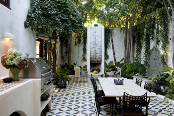
{Inspiring Outdoor Spaces that are just as Beautiful as Indoor Spaces – Image via Commune Design}
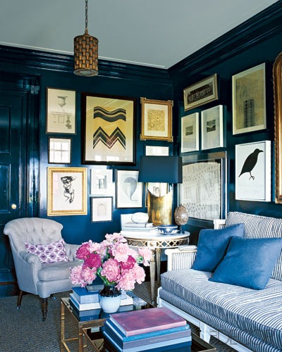
{Lots of High Gloss Paint – Image via ELLE DÉCOR }
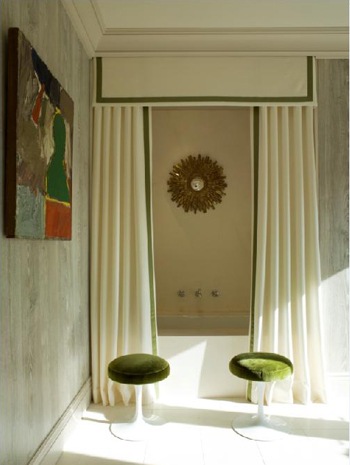
{Rooms that are neither Overtly Feminine nor Masculine, just Beautiful
– Image via Francois Hilard}
So, what would you all like to see more of in 2011? What would you like to see go away?


0 comments:
Post a Comment