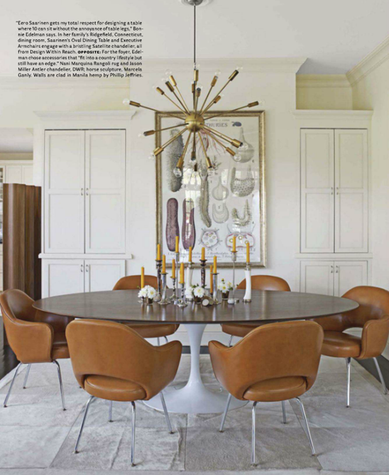
The April 2012 issue of House Beautiful is good! If you haven’t read it yet, be sure to get your hands on a copy very soon, my dears. I found it so refreshing to see so many new interiors and designers featured in this issue. I also loved their special report on the design industry in Los Angeles, especially because so much of my love for that city is tied to the amazing design community there. I was especially struck by two of the design spreads: “The Warm Side of Modern” featuring an amazing Connecticut home designed by photographer, Bonnie Edelman (I am obsessed with the masculine chic aesthetic in this home!) and “Boldly Pretty” designed by the talented Kelie Grosso of Maison Luxe in Seattle (I love that this home is pretty rather than industrial-inspired. Can we do pretty more often, design world? Thank you!). I found the dining rooms in both homes to be completely gorgeous—as well as completely different from one another. Given the choice, which dining room would you select? Which one is more in line with your style?
A Saarinen Tulip table, modern chairs upholstered in rich, cognac-colored leather, and a Sputnik chandelier make this room ultra-chic.
Classic elements such as French-inspired chairs, a crystal chandelier, and painted panels give lend a sense of romantic elegance to this dining room. The turquoise leather upholstery adds a modern touch to an otherwise traditional room.
Which dining room gets your vote?
{Images via House Beautiful}


0 comments:
Post a Comment