At this point, I feel like I should probably just accept the fact that I have grown to be a fan of the color blue. It has never been my favorite color, but over the past year or so, I have come to really love deep cobalt, navy, and peacock blue hues. Some blues are flat, but others, like the color used on this stunning cottage have such rich depth that it’s nearly impossible not to love the color. Featured in the August issue of Style at Home, this lakeside cottage in Ontario was designed by Dee Dee Taylor Eustace of Taylor-Hannah Architects. The home’s lakeside setting sets the tone for the palette used both on the exterior as well as the interior.
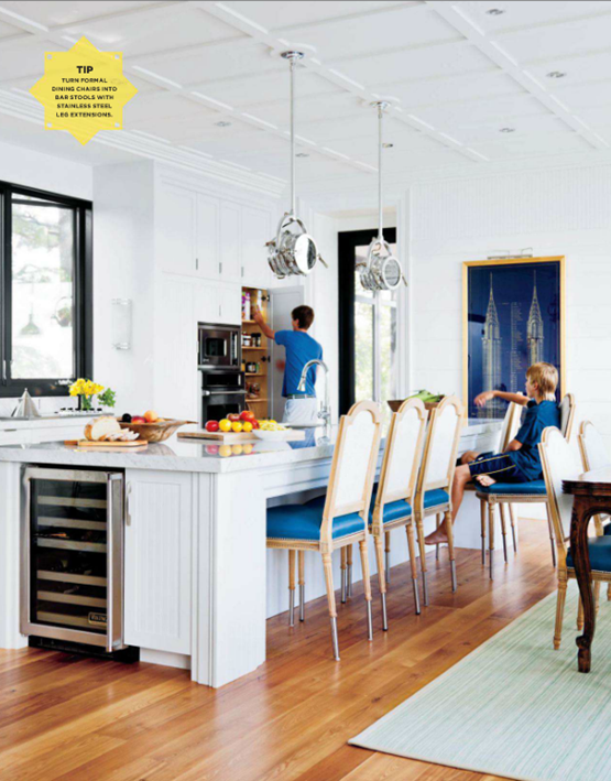
{The kitchen is bright and open. I love the framed print of the Chrysler building. It looks like they used the same chairs that are around the dining table and used them as stools by adding some sort of extensions to the legs. I’ve never seen anything like that before and I can’t say I am crazy about them. I like the room quite a bit but the “stools” and the pendant lights don’t make sense to me. The lights look cool, but the light would not be dispersed properly if they ever turn them on since they aren’t facing down our up.}
{The dining chairs are lovely and the Global Double Arm Sconce by Michael S Smith for Visual Comfort & Co. is the perfect accent in this stunning vignette.}
{How fabulous are the windows surrounding the living room?}
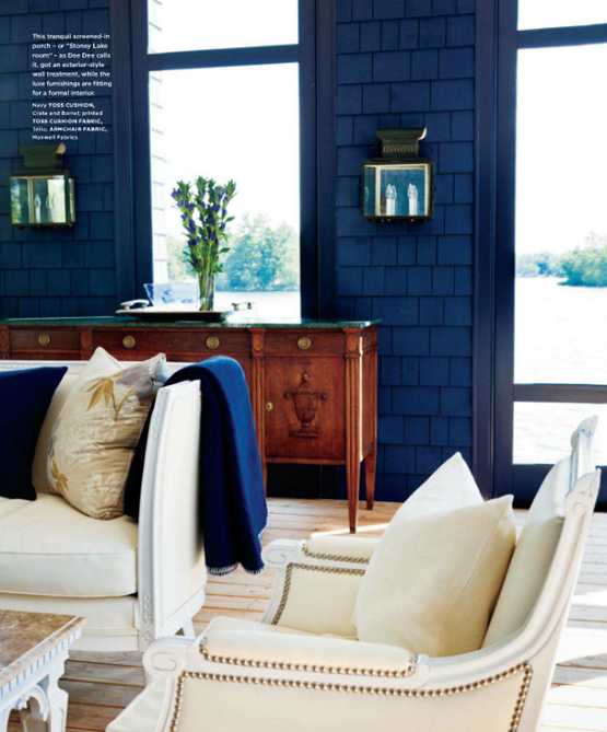
{Eustace opted for an exterior-style wall treatment for the screened in porch. I love the continuity it creates as it literally brings the outdoors in.}
{The cream furniture works beautifully against the deep blue background. This home truly illustrates the power of color.}


0 comments:
Post a Comment